Stay Out of the Dark - Postmortem


Outline
- Lighting
- Other Tech
- Gameplay/Level Design
- Art
- Music
- Cinematic
- The ENGINE BUG
- Closing Thoughts
Lighting
The most complex part of the game. This was the game's key system and the core thematic idea that spawned the idea of the game:
"Spread" light to create safe paths through the puzzles. If you touch the dark, you die.
Creating this effect from scratch in Unreal Engine wasn't straightforward and in the end wasn't as polished/optimized as I would have liked, but it get's the job done. Early on this was attempted using procedural meshes and translucent materials to achieve the darkening effect of unlit areas, but this quickly became unfeasible as supporting multiple light sources requires complex mesh subtraction operations to remove the lit area from a starting rectangular mesh encompassing the overall area. I quickly realized this wasn't going to work and nearly pivoted the game away from this mechanic.
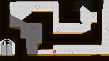
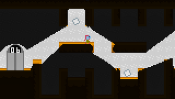
Instead, I refocused to post-processing based solution that uses a runtime generated shadow mask texture that is used to darken the areas of the screen that are in shadow. The final system implemented in game uses lighting components placed within the level that cast a preset number of rays(line traces) in all directions from it. The locations along these rays where they collide with the level geometry are used to create a set of triangles and their vertices that represent the area in world-space that is to appear lit by this light. A lighting subsystem queries each light in the scene each frame for these triangles and then projects them to screen-space. The screen-space projected traingles are then rendered to the shadow mask render target and used by the post process material to create the final visual effect.
Finally, a quick but very impactful optimization was done to skip processing of any lights that were deemed to be irrelevant to the current frame, meaning that their entire circular area falls completely off-screen. This was enough to make the lighting performance mostly constant regardless of scene size and good enough to easily hit 120FPS on my development machine.
Results
The end results of this process are still unfortunately a bit wonky. The nature of the "cast rays in all directions" approach is that the lighting is never fully accurate. Interior corners often end up being between two rays, and as such end up appearing dark. Exterior corners often get "over-lit", with the light cutting-through the corner from either side of it.
The real solution to this is to take the world geometry directly into account and project shadows from line segments, or to cast rays directly at vertices. Getting access to this information and limiting it only to what can cast shadows or relevant to the light wasn't trivial and I determined it wasn't worth diverting the time that would be required to figure it out away from more important gameplay elements. Additionally the geometry of tilemaps is not optimized and does not combine adjacent colliders into singular large colliders. This creates a lot of extra vertices/line segments that complicate the matter further. I may revisit this in a future experiment. The thing I'd most like to see is for the section of the floor hit by the light to also be illuminated.
Other Tech
Pixel Perfection
A large focus for me with this jam was to give myself an opportunity to really flex some of the tech I've been working on relating to the 2D game development with Unreal Engine. One of these was the Pixel Perfect graphics and camera system. This game was envisioned to have a very low-res look with very large, crisp, blocky pixels. A lot of pixel art games these days go with something resembling 640x360 (360p) for their resolution, as it scales perfectly to most common resolutions in use these days, including 720p, 1080p, 1440p, and 4k, while still retaining the visible pixel art aesthetic. I began with this in mind, but wanted to go further. If 360p is the modern version of SNES graphics, I wanted to have a more Atari-like look, so I quartered the resolution and went with 160x90.
Sprites are rendered with a pixel snapping material that always rounds the sprites vertices to the nearest "upscaled pixel" position. You can actually tell that this is what's happening in-game if you pay close attention to the player movement. It's possible to manipulate your player's in-game location to sometimes fall down a ledge and sometimes stand on top of it, despite appearing to be in the same place, for-example.
Tiled Importing
Paper2D's Tiled support is, to put it simply, terrible. It requires using tiled's JSON format as well as other annoying things like requiring embedded tilesets and doesn't support reimporting at all. This means that every tilemap will use a copy of the same tileset and if you need to make changes you need to import from scratch and replace all the old assets with new ones.
A few weeks ago I made the beginnings of a Tiled importer for Unreal Engine on stream that addresses these issues and this was the perfect opportunity to really stress test it. It worked extremely well and without a doubt I would not have been able to author 10 levels for this game without it. The iteration speed was rapid enough for me to easily go through dozens of changes for each level. The final 3 levels added to the game were all done in just about an hour and a half!
I also uncovered some edge-case issues that my importer needs to deal with before being production ready. Namely, tilemap resizing.
Gameplay/Level Design
The gameplay is unfortunately the weakest part of the game, from my perspective. The character controller is basic and there are no other movement abilities. The game was intended to be a puzzle platformer but I found it very difficult to design levels with actually interesting puzzles within them. Part of the problem is that every light is an omnidirectional point light. This made it difficult to have precise control over which locations were lit and which were dark.
Art
I am not an artist. You probably noticed that if you played the game. That said, I stuck with mostly very flat colors to stay in line with that Atari inspiration with the knowledge that most of it would be too dark to see much anyways.
The tech art side of the game had more effort put into it. The player's death dissolve effect was done in a fairly hacky fashion (and lead to the discovery of the ENGINE BUG), but other effects like the elevator level display I'm more proud of.
Music
Simple but effective.
The main piece of music was a layering of some builtin HALion Sonic presets that came with Cubase and a synth pad patch from my Nord Stage 4. All the layers were controlled using the same midi performance recording to achieve a more unified sound. I would have liked to have allocated myself a little more composition time for this piece as I feel the loop isn't particularly smooth due to the tempo change and the B section doesn't really develop as much as it should. There were a couple ideas in the Cubase session that I didn't get a chance to fully explore.
The ending theme was from a previous composition idea that I already had and immediately came to mind when I did the ending cinematic visuals. I still had to record it from scratch and heavily edit it have multiple loop points to make it dynamic with the game's cinematic. You can decide for yourself if this is outside the spirit of a game jam but in my opinion it's a valid representation of the creative process to reach back to previous ideas that didn't go anywhere and reshape them to the current context into a finished product.
Cinematic
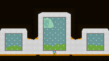
Probably the most polished part of the game. I'm quite happy with how the ending turned out.
As a musician myself, one of my favorite things to pay attention to in regards to the direction of video game cinematics is how well they incorporate music. In this game I finally gave myself the opportunity to explore this pairing of audio with visuals myself.
The music is organized into 3 main sections. In the last level of the game, the main background music fades and gives way to a very subdued intro loop to make the player aware that their progression to this point matters. Once the player moves outside, a transition to the main more melodic section is queued and the cinematic begins in time with the start of the transition. The music then transitions into a final loop that goes between the two moods as the camera fades out and stays in that loop until the player leaves the credits scene.
Implementation-wise this was done with MetaSounds and pretty janky. If something were to go wrong and the first transition were to never occur or not be noticed by the game thread, the cutscene would never play and the game would softlock. It seems that this style of dynamic music would likely be better implemented with Quartz so that the game has better knowledge over the state of the music. This is something I'm excited to experiment with more soon and hopefully build a nice dynamic music system for my main project that can provide a rich audio experience for both gameplay and cinematics.
The ENGINE BUG
As mentioned before, this submission was unfortunately impacted by a sinister Unreal Engine bug. To try to keep it simple, it seems that in UE 5.3 (and likely some versions before), it is possible during the last frame of gameplay in a level for a sprite's material to get removed from memory before the render thread version of the sprite is finished with it, causing various memory-related crashes. In the editor this was a common occurrence for me as closing the game while the player was in the dark would cause the render thread to try and update the dynamic player material's dissolve parameter after the material was garbage collected.
I thought initially that this was an Editor only bug, but as it turned out the problem wasn't just limited to dynamic materials on sprites, but rather could manifest itself on ANY sprite in the scene whenever you load a new level. This particular version of the bug I never experienced until late in the jam when testing a Shipping build. Unfortunately I couldn't figure out how to reproduce it in time for submissions but likely wouldn't have had time to actually fix it in time for submissions anyway.
Once I learned more about the crash and cause, I found out that Epic was already aware of the problem, and it's fixed in Unreal Engine 5.4. The only problem here (besides already being outside of the submission period) is that UE 5.4 isn't out yet, and there's no release date. I was able build the current version of 5.4 from source and get the game project working with it, but unfortunately can not upload the build until the rating period for the jam ends. If you're having issues with the game as is and would like to play the fixed version I will upload it at that point.
Closing Thoughts
I had very simple goals for myself for this project and feel that I met them well. My custom 2D tech worked quite well and I ended up with a fairly well polished experience with a clear beginning and end. Compared to my last jam submission (The Clean Sweeper), this game is far better.
That said I'm left feeling quite burned out by this particular project and eager to get back to The Clean Sweeper and polishing my tools. I don't think I'll continue this project but can't completely count it out at some point in the future. If the lighting were polished and movement/platforming given some focus there's probably a decent game in there.
Files
Get Stay Out of the Dark
Stay Out of the Dark
Spread the light to avoid an untimely end.
| Status | Prototype |
| Author | TheCoolSquare |
| Genre | Platformer |
| Tags | 2D, Puzzle-Platformer, Unreal Engine |
More posts
- Hotfix ReleaseFeb 27, 2024
Leave a comment
Log in with itch.io to leave a comment.